区块编辑器是一个 React 单页应用程序 (SPA)。编辑器中的每个区块都通过一个在用于在客户端注册该区块的设置对象中定义的 edit 属性的 React 组件进行显示。
区块的 Edit React 组件接收到的 props 对象包括:
attributes: 包含区块所有属性的对象。setAttributes: 用于更新属性对象的函数。isSelected: 一个布尔值,表示区块当前是否被选中。
WordPress 提供了许多内置的标准组件,可用于在编辑器中定义区块界面。这些内置组件可通过诸如 @wordpress/components 和 @wordpress/block-editor 等包获得。
区块工具栏或设置侧边栏中的区块自定义设置控件也可以通过此 Edit React 组件通过内置组件(如)定义:
内置组件
@wordpress/components 包包含一组通用的 WordPress 组件库,用于为区块编辑器和 WordPress 仪表板创建常见的 UI 元素。该包中一些最常用的组件包括:
@wordpress/block-editor 包包含一组用于区块编辑器的组件和钩子,包括定义区块自定义设置控件的组件。该包中一些最常用的组件包括:
@wordpress/block-editor 包还提供了创建和使用独立区块编辑器的工具。
在使用组件为区块编辑器工作时,一个好的工作流程是:
- 从 WordPress 包中导入组件。
- 以 JSX 格式将组件的相应代码添加到您的项目中。
- 大多数内置组件将用于设置 区块属性,因此请在
block.json中定义任何必要的属性,并在您的组件中使用setAttributes创建事件处理程序来更新这些属性。 - 如果需要,将代码调整为可序列化并存储在数据库中。
区块控件:区块工具栏和设置侧边栏
为了简化区块自定义并确保一致的用户体验,有几个内置的 UI 模式可用于生成区块的编辑器预览。
下图详细介绍了选中段落区块时的区块工具栏和设置侧边栏。
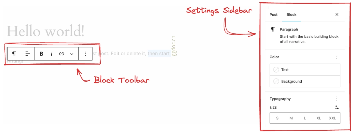
区块工具栏
当用户选择一个区块时,可能会在所选区块上方的工具栏中显示一些控制按钮。其中一些区块级控件可能包含在内,但您也可以自定义工具栏以包含特定于您区块类型的控件。如果您的区块类型的 Edit 函数的返回值中包含一个 BlockControls 元素,那么这些控件将显示在所选区块的工具栏中。
export default function Edit( { className, attributes: attr, setAttributes } ) {

    const onChangeContent = ( newContent ) => {
        setAttributes( { content: newContent } );
    };

    const onChangeAlignment = ( newAlignment ) => {
        setAttributes( {
            alignment: newAlignment === undefined ? 'none' : newAlignment,
        } );
    };

    return (
        <div { ...useBlockProps() }>
            <BlockControls>
                <ToolbarGroup>
                    <AlignmentToolbar
                        value={ attr.alignment }
                        onChange={ onChangeAlignment }
                    />
                </ToolbarGroup>
            </BlockControls>

            <RichText
                className={ className }
                style={ { textAlign: attr.alignment } }
                tagName="p"
                onChange={ onChangeContent }
                value={ attr.content }
            />
        </div>
    );
}
请注意,BlockControls 仅在区块当前被选中且处于视觉编辑模式下时才可见。在 HTML 编辑模式下编辑区块时不会显示 BlockControls。
设置侧边栏
设置侧边栏用于显示较少使用的设置或需要更多屏幕空间的设置。设置侧边栏应仅用于区块级设置,并在选中区块时显示。
如果某个设置仅影响块内的选定内容(例如“加粗”文本),请勿将该设置放在设置侧边栏中。请使用工具栏。即使在 HTML 模式下编辑区块时也会显示设置侧边栏,因此它应仅包含区块级设置。
类似于渲染工具栏,如果您在区块类型的 Edit 函数的 return 值中包含一个 InspectorControls 组件,那么这些控件将显示在设置侧边栏区域中。
export default function Edit( { attributes, setAttributes } ) {
    const onChangeBGColor = ( hexColor ) => {
        setAttributes( { bg_color: hexColor } );
    };

    const onChangeTextColor = ( hexColor ) => {
        setAttributes( { text_color: hexColor } );
    };

    return (
        <div { ...useBlockProps() }>
            <InspectorControls key="setting">
                <div>
                    <fieldset>
                        <legend className="blocks-base-control__label">
                            { __( '背景颜色', 'block-development-examples' ) }
                        </legend>
                        <ColorPalette // Gutenberg 标准颜色选择器的元素标签
                            onChange={ onChangeBGColor } // onChange 事件回调函数
                        />
                    </fieldset>
                    <fieldset>
                        <legend className="blocks-base-control__label">
                            { __( '文字颜色', 'block-development-examples' ) }
                        </legend>
                        <ColorPalette
                            onChange={ onChangeTextColor }
                        />
                    </fieldset>
                </div>
            </InspectorControls>
            <TextControl
                value={ attributes.message }
                onChange={ ( val ) => setAttributes( { message: val } ) }
                style={ {
                    backgroundColor: attributes.bg_color,
                    color: attributes.text_color,
                } }
            />
        </div>
    );
}
在工具栏和侧边栏中渲染的块控件,在选择多个相同类型的块时也可用。
对于常见的自定义设置(包括颜色、边框、间距等),您可以依赖 块支持 而不是自定义解决方案。块支持提供与其他核心块功能相同的一致 UI。